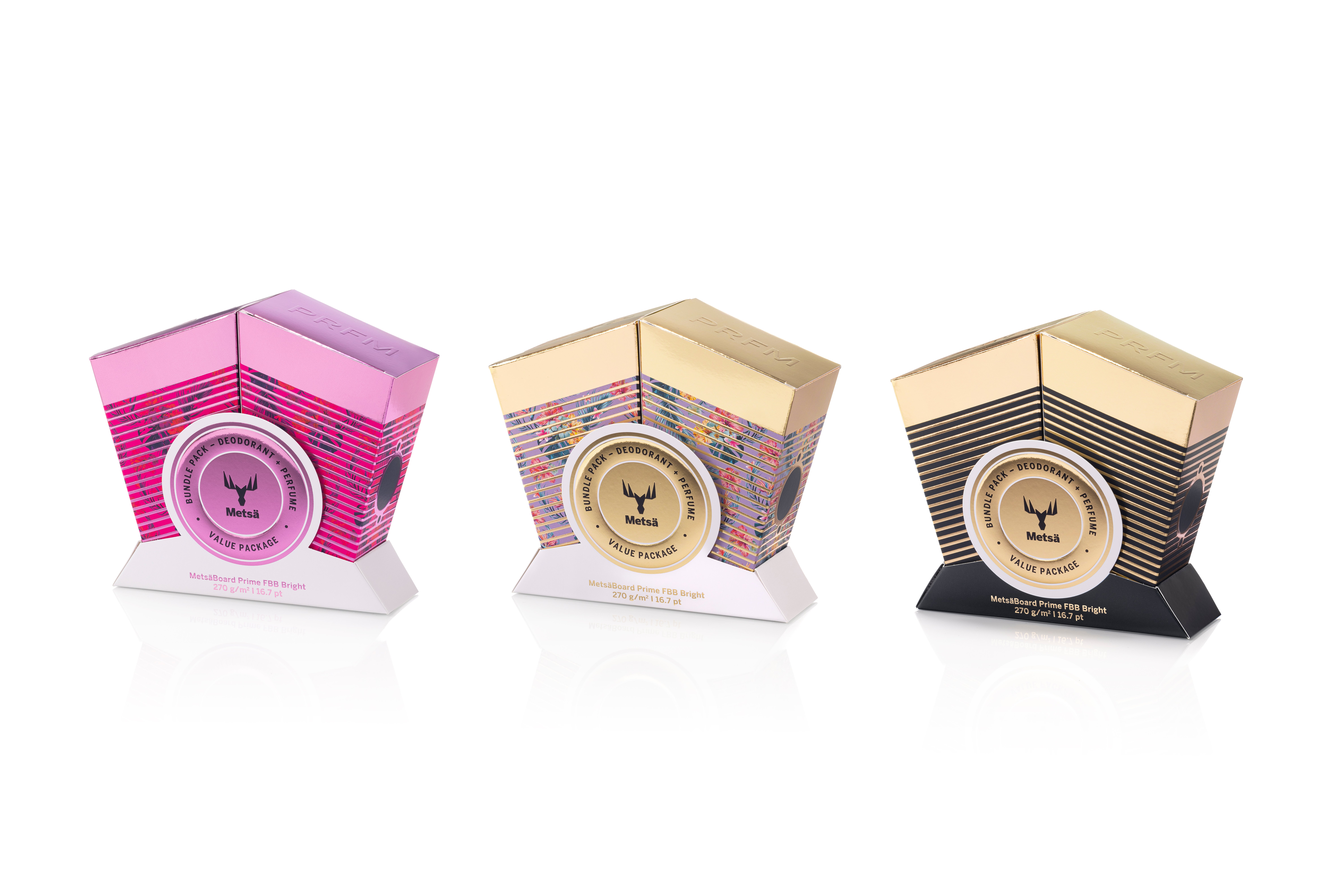
Marko, the V Engine packaging concept is one of your latest prototype designs; what inspired the idea?
Marko: The original idea came from my passion for motorcycles. I used to ride and build motorcycles myself and wanted to bring that bold, mechanical aesthetic into a packaging design. The shape of the packaging is similar in structure to a classic V2 engine, particularly the kind associated with Harley-Davidson motorcycles. We wanted the design to appeal to men’s grooming products, like fragrances and deodorants, but there’s also a case that can be made for women’s cosmetics as well. It’s quite unique and makes a strong visual impact on the shelf.

From a technical perspective, what makes the V Engine concept unique?
Marko: We decided to use the MetsäBoard Prime FBB Bright 270 gsm grade for this design and what makes it truly stand out is its sculptural form combined with its manufacturability. At first glance, it looks complex, but we designed it to make the production and converting process quite efficient. The packaging consists of two boxes forming the shape of an engine when combined. We use the same die-line tool for both boxes to make it as efficient as possible. The packaging is also side-seam glued, meaning it can be assembled using standard machinery, which is not always the case with structures and designs that have unique forms.
Was ease of production a particular challenge for the V Engine concept?
Marko: Production feasibility is one of the most significant barriers to adopting unconventional packaging. Many bold packaging ideas never make it past the concept phase because they’re too complex or expensive to manufacture. Converters often assume that complex designs will be too difficult or costly to produce at scale. We wanted to design this concept to be fully manufacturable with existing machinery. It doesn’t have any 90-degree angles, but it is efficiently glued and assembled. That balance between innovation and practicality makes it appealing for brands looking for something unique without excessive costs.
As you said, it’s a pretty unique design; what was the thought process during the development stages, and how can it impact a company’s branding efforts?
Marko: We wanted to design this concept so the structure itself would have shelf appeal and make a statement. It has a bold shape that immediately attracts attention, making it stand out on the shelf compared to conventional rectangular box designs. The surface details and reflections create a really dynamic effect when it’s viewed from different angles, and it can draw the eyes of consumers as they pass by a store shelf.
How can brand owners typically use these unique prototype concepts produced by your design team?
Marko: Concepts like this generally serve two main purposes. They can demonstrate the innovative capabilities of our paperboard and design services. And they provide a foundation for brands to customise and adapt the design to their own identity. For example, a brand owner can modify the colour scheme, foil effects, or dimensions to fit its product range. The same structural idea can also be tailored to different markets, whether for high-end cosmetics, speciality gifts, or premium men’s grooming products.
Has there been any feedback from potential clients so far?
Marko: Yes, we’ve received a lot of interest, especially from brands that want to break away from traditional rectangular box designs and create something that immediately catches the consumer’s eye. We’ve found that these types of concepts usually align well with brands that have strong identities, like motorcycle or automotive-inspired fragrances. We also see potential in other industries looking for bold, standout packaging that reinforces their brand message. When we showcase these designs, we highlight the branding impact and the practical benefits, but also how they can be manufactured efficiently at scale.
What’s the next step for this concept? Do you have any plans to submit it in packaging design competitions?
Marko: We’re exploring variations that use pre-laminated metallic paperboard instead of separate foil stamping, making the design more accessible to brands with different budget considerations. We’re definitely planning to submit the design to competitions. At the end of the day, our team’s goal is to showcase what is possible with high-quality paperboard and inspire brand owners to rethink their packaging solutions. Those showcases help validate the innovation behind the concept and highlight our design team’s capabilities. When we create these packaging concepts, we don’t just wait for brands to approach us—we actively present the designs to brand owners as potential solutions. Some brands are looking for off-the-shelf packaging concepts that they can adapt with minor modifications, but others are also interested in fully customised versions, and we’re happy to help them with that.
Don’t miss Part 2 of this interview series, which discusses a new hot foil embossed packaging prototype designed by Marko and the Metsä Board Design team.
