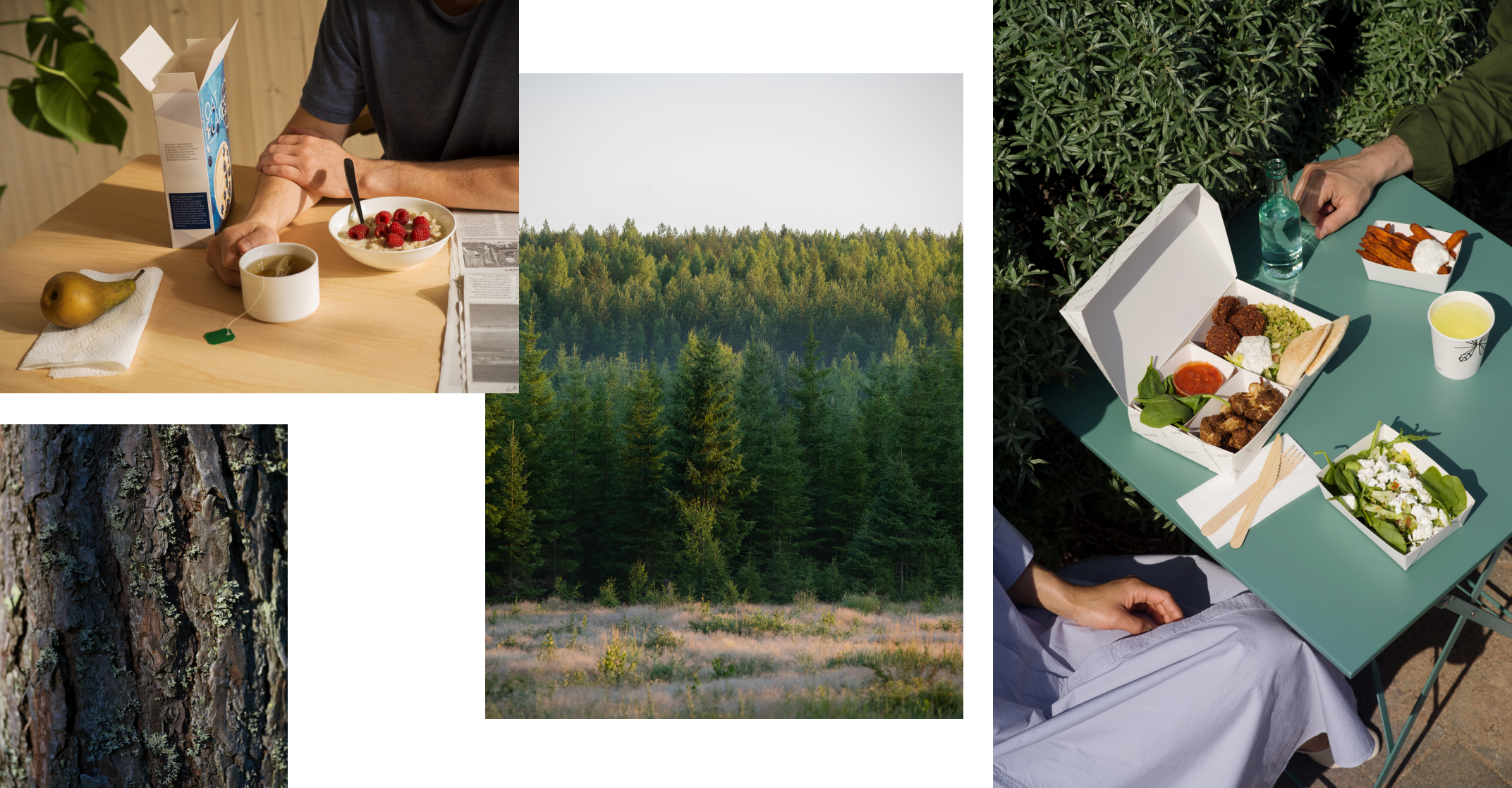
Clarity, Closeness and Cutting Edge – these design drivers are what guides the way we create and use imagery for the brand.

Metsä Group image styles
Visual world
Clarity in imagery is represented by a genuine and natural view of the subject, avoiding the feel of staging and heavy grading or effects. Authenticity should be visible, as it enforces the reliable feel of the brand.
Closeness is evident through the use of natural light, warmth and maintaining a positive emotion. Careful and conscious cropping brings the viewer to the subject.
Cutting edge means that our image treatment should remain relevant over time and feature subjects in an innovative, fresh and vibrant way.

Colour and contrast
Keep colours calm but bring out the richness of the natural colour in objects or scenes to emphasise diversity and create warmth. The picture should capture and bring forth the authentic feeling for the viewer.
The use of a natural looking light source and contrast to create clean graphic shadows creates the sense of quality and clarity.

Composition and cropping
When considering composition we want to maintain a clear and unfussy viewpoint. Either by getting close to the subject with bold crop on the key subject. Or by keeping an extended distance from and wide view of the scene. Try to avoid the in between middle ground where the focus of the subject and surroundings become confused.
Prefer considered angles like eye-level views of the subject or top down angles.


