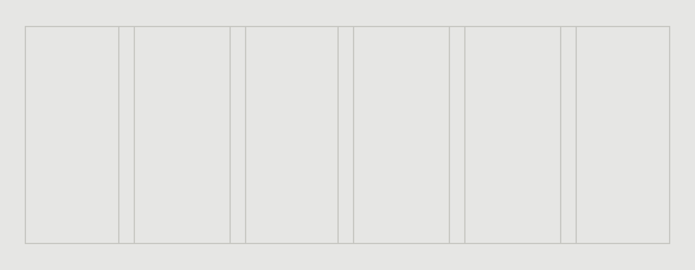
Metsä Group’s layouts utilize a column-based grid system as an underlying substructure for consistent placement and sizing of elements across all applications.

Layout and composition
Posters and advertisements
The logo is primarily positioned to the bottom left corner in the most common vertical poster or advertisement formats.

Publications
The logo is placed on the top right or left corner in the front and back covers of the publications or brochures.

Roll-ups and event stands
The use of logo is more versatile on event stands depending on the specific application. On rollups the logo is in a more subtle signatural role whereas elsewhere it is used independently as a central identifier.

Stationery basics
The logo is used impactfully as an identifier in contexts where it is the only visual element.

Banners
The placement of the logo and other elements varies depending on the exact format and the amount of content. The logo should be given sufficient empty space in relation to the other elements e.g. placed to the opposite corner.

Presentation templates
Use of the logo varies depending on the type of template. In the starting and ending slides the logo has a more prominent role, whereas in the content slides it has a more subtle signatural role.

Digital interfaces
The logo is placed in the top left corner in interfaces such as website headers. The use of the moosehead alone is recommended in contexts where space is limited, such as social media profile images.


